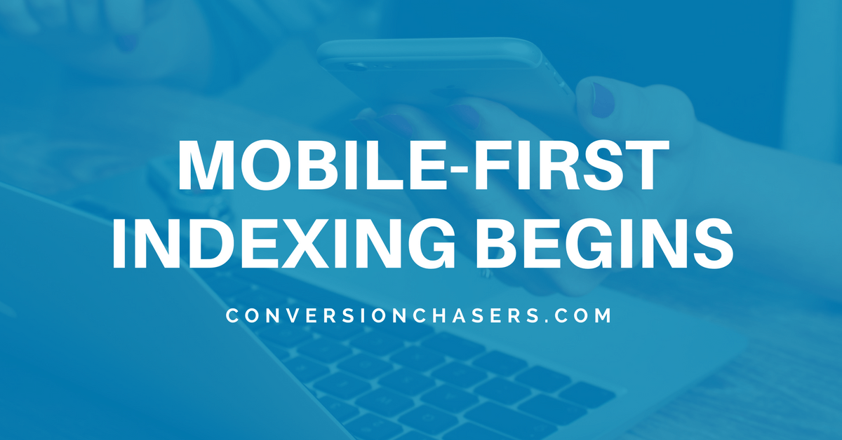
Google Confirms Mobile-First Indexing Has Begun
Don't Get Left Behind! Discover The Importance Of A Mobile Optimized Website
Google has finally announced that mobile-first indexing has begun. On March 26th they released a post on the official Google Webmaster Blog stating: "Today we’re announcing that after a year and a half
of careful experimentation and testing, we’ve started migrating sites that follow the best practices
for mobile-first indexing." This is huge news for the entire digital landscape as we know it. It stresses the increasing importance of having a mobile optimized website as it can impact SEO & Search Rankings dramatically moving into the future.
The Full Mobile-First Indexing Blog Can Be Found Here:
https://webmasters.googleblog.com/2018/03/rolling-out-mobile-first-indexing.html
What is Mobile-First Indexing?
Let's read exactly how Google describes it:
"To recap, our crawling, indexing, and ranking systems have typically used the desktop version of a page's content, which may cause issues for mobile searchers when that version is vastly different from the mobile version. Mobile-first indexing means that we'll use the mobile version of the page for indexing and ranking, to better help our – primarily mobile – users find what they're looking for.
We continue to have one single index that we use for serving search results. We do not have a “mobile-first index” that’s separate from our main index. Historically, the desktop version was indexed, but increasingly, we will be using the mobile versions of content."
This means that Google is now crawling the mobile version of many websites vs. the desktop version. Due to the increasing number of searches from mobile devices, it makes sense that Google is moving in this direction. Mobile web traffic and Google searches continue to increase each year as phones improve and internet gets quicker. Many reports suggest that mobile traffic counts for over 50% of all traffic on the web today.
What Does That Mean For Your Website?
Having a mobile optimized website is imperative if you want to see success with SEO and rankings in the long term. Moving into the remainder of 2018 & beyond having a responsive website that looks good on all devices, loads content fast, and is user friendly is the new expectation. Users are expecting a website to load immediately and be optimized for their smartphones & tablets. Research shows if they get to a website which doesn't follow these best practices they will simply bounce and find a website that does.
What if your website is not optimized for mobile? Google says not to panic and that this roll out won't impact rankings drastically, but they then go on to state:
"Having said that, we continue to encourage webmasters to make their content mobile-friendly. We do evaluate all content in our index -- whether it is desktop or mobile -- to determine how mobile-friendly it is. Since 2015, this measure can help mobile-friendly content perform better for those who are searching on mobile. Related, we recently announced
that beginning in July 2018, content that is slow-loading may perform less well for both desktop and mobile searchers."
So all this might sound pretty scary if you do not have a mobile optimized site yet. But the good news is that you are not totally out luck. Google has stated that it will still index your desktop site in these circumstances, however, you will be putting yourself at a disadvantage and potentially missing customers if you continue to put it off.
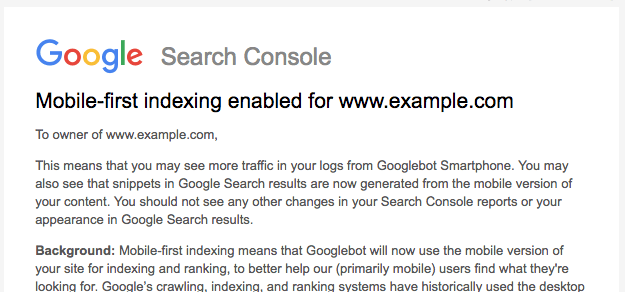
How Do You Know When This Change Will Occur?
Luckily, Google will be informing users when the mobile-first indexing switch takes place via a Google Search Console Message. You will see the following message below if the mobile version of your website is now being used for indexing by Google.
When Will The Mobile-First Index Be Fully Rolled Out?
In short, no one is certain of an exact date this indexing update will be fully implemented. This large scale roll out is still considered in it's "testing phase" by Google. That means if it goes well they could choose to accelerate the program, or if they run into issues they could push it back further. Either way, this is a fundamental change of how websites are crawled and indexed by the worlds largest search engine.
This is why millions of businesses are investing in a Responsive Website
design which automatically adapts to each device and screen size it is being viewed on. Don't get left behind. Now is the time to ensure your website puts you in the best position for continued success.

Interested In Discussing A Website Design Project? Click Here To Schedule A Call Today!

